St. Patrick’s Day is just around the corner and we’re about to witness a whole lot of shades of green around town. But, there’s just something about those glittery Shamrock green hats and inexpensive t-shirts that give the color a bad reputation (even though we find ourselves sporting it year after year). In the spirit of this festive day, we wanted to explore some tasteful shades of green to use around the home.
Follow along and let us know which one is your favourite!
Shades of Green
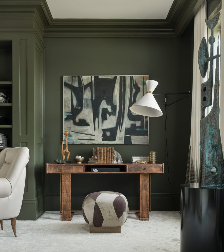
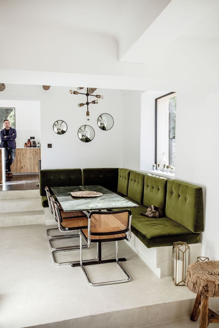
1. Olive Green
“Olive is a kind of muddy green color. In actuality, it is really a shade of dark yellow (when gray or black is added to yellow, the various shades of the color olive are produced).” – Wikipedia
We love Olive Green for it’s warmth and sophistication. It reads old school but if used appropriately, can be quite modern and it pairs nicely with warm wood tones. Other shades close to it include Army Green and Reseda Green.
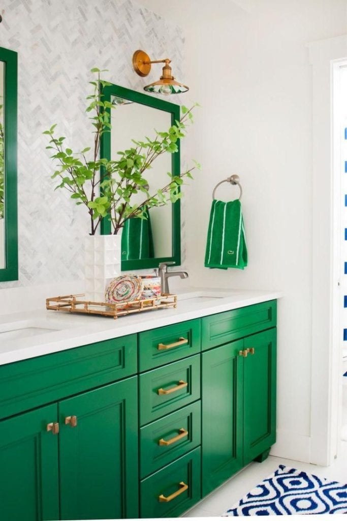
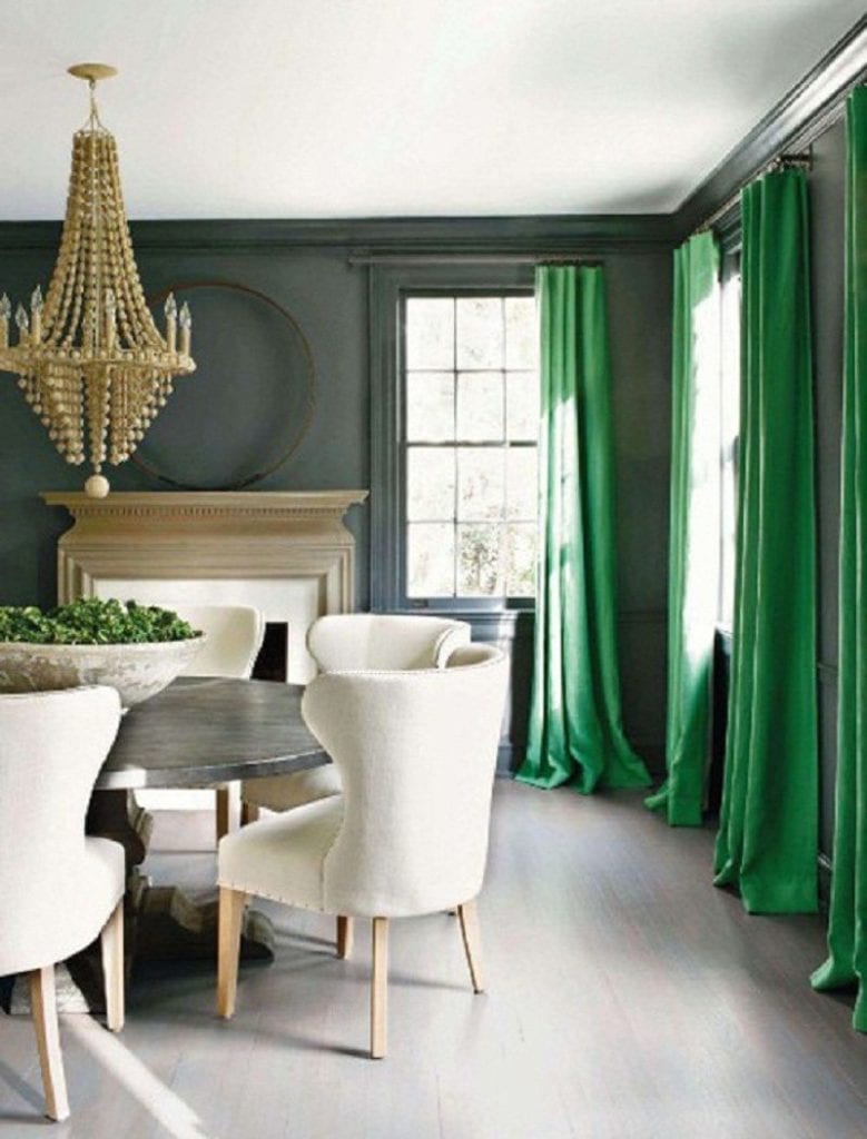
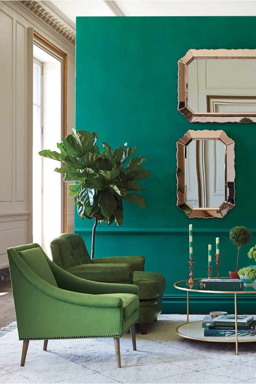
2. Kelly Green
“Kelly green is an American term. The name derives from the fact that the surname Kelly, as well as the color green, are both popular in Ireland. The first recorded use of the term kelly green as a color name in English was in 1917.” – Wikipedia
We love Kelly Green because of it’s bold preppy yet traditional look, very Ralph Lauren. It has a surprisingly elegant feel and adds vibrancy to any room without reading too loud. It pairs beautifully with brass accents.
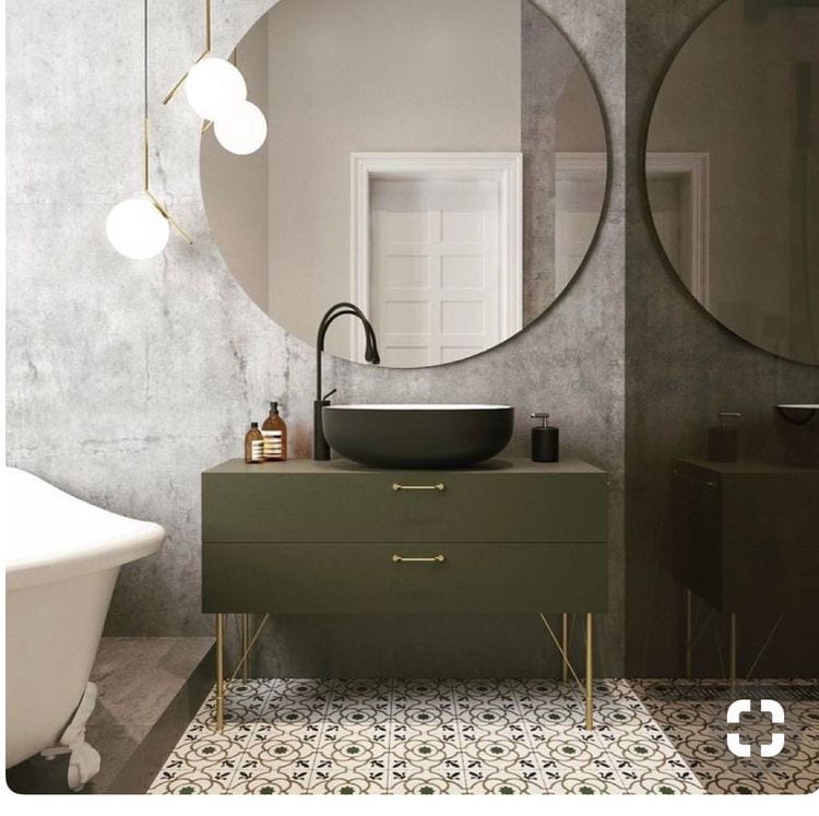
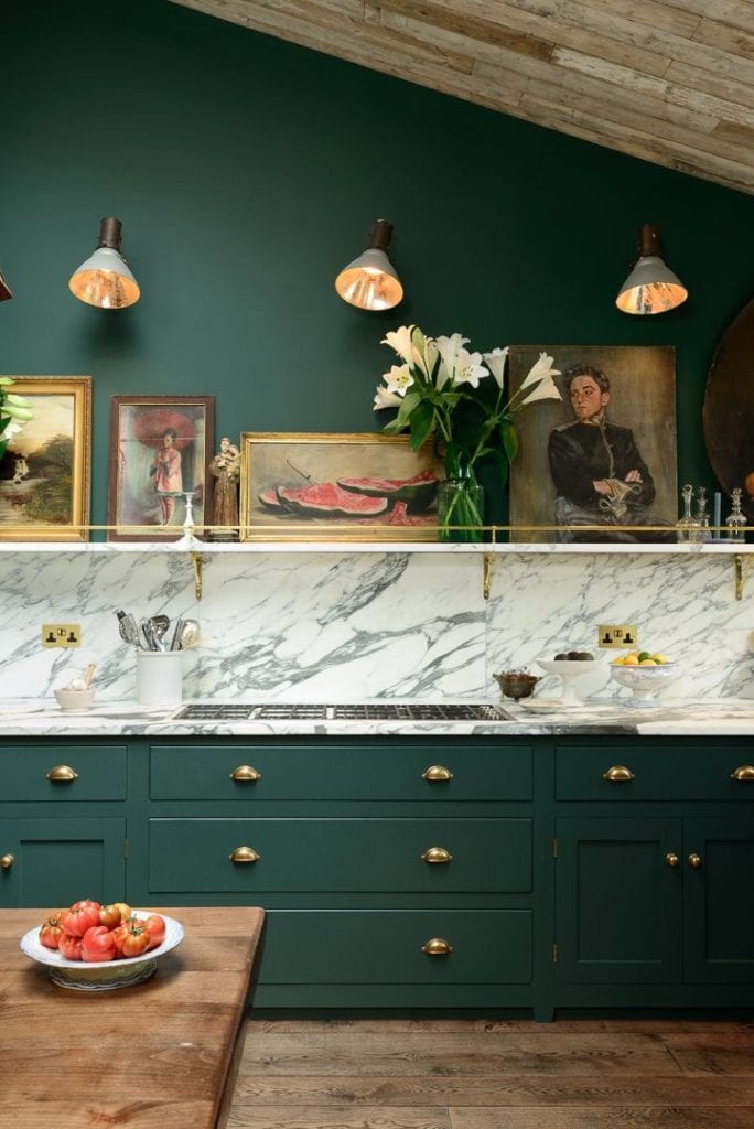
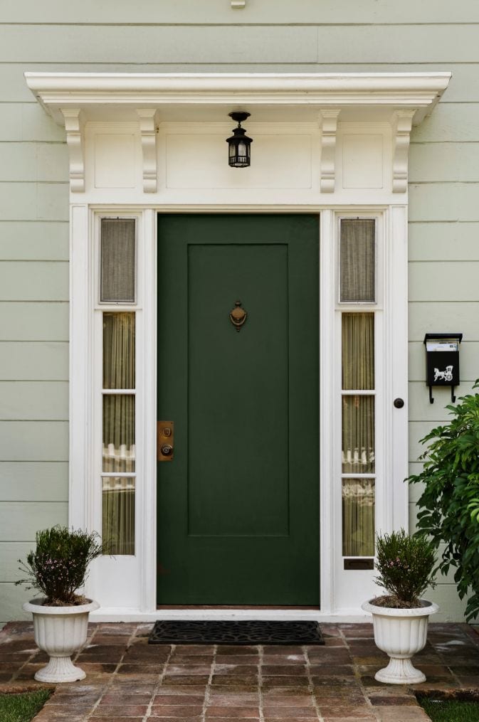
3. Pine Green
“Pine green is a rich shade of spring green that resembles the color of pine trees. It is an official Crayola color (since 1903) that is this exact shade in the Crayola crayon, but in the markers, it is known as crocodile green.” – Wikipedia
We love Pine Green because it’s got an earthy feel without being dull. It brings a fresh approach to any space and pairs beautifully with maroon or burgundy. Shades of green similar to Pine Green are Teal and Myrtle Green.
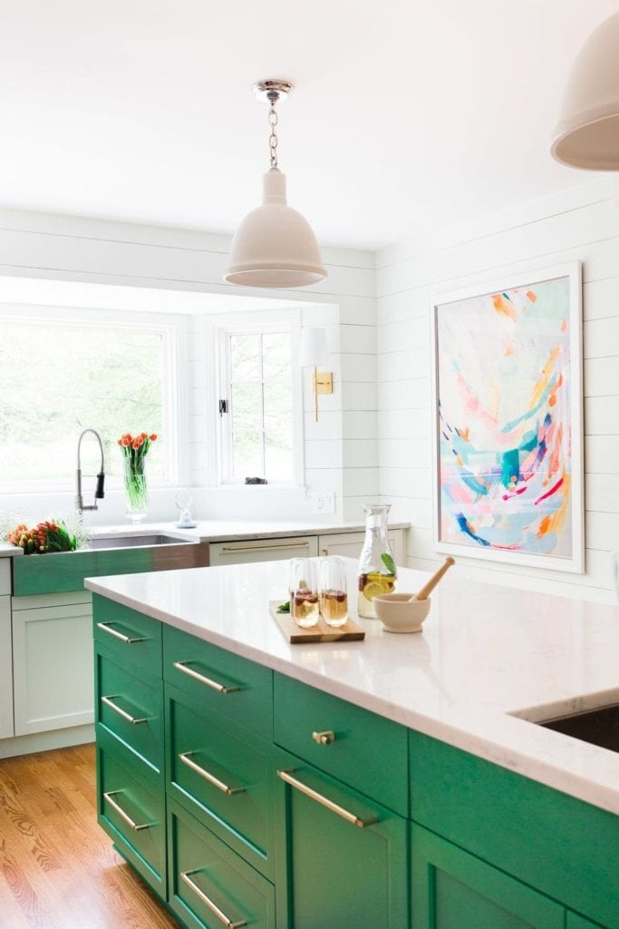
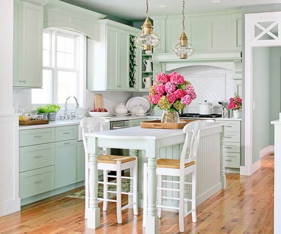
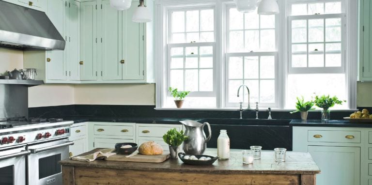
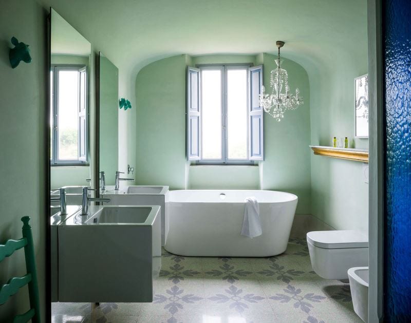
4. Mint Green
“Mint green is a pale tint of green that resembles the color of mint green pigment, and was a popular color in the 1950s, and 1990s.” – Wikipedia
We love Mint Green because it’s retro! You know a color was popular when large appliances were being made into it. That being said, we do love how it’s making a comeback, especially in the kitchen. Light shades of mint bring a sense of freshness into a space that can’t be described and it pairs nicely with lighter woods and of course, natural light.
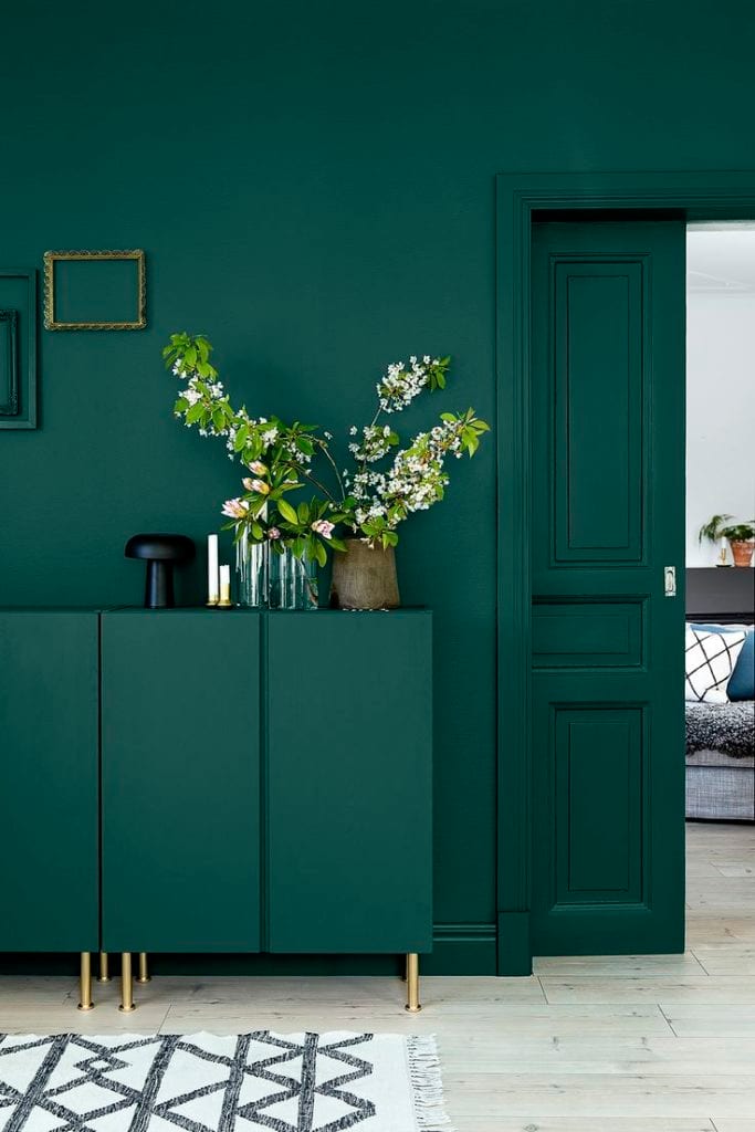
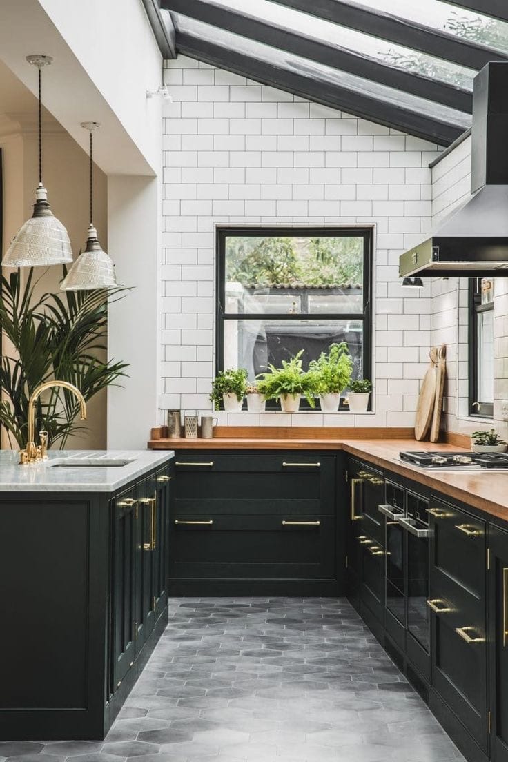
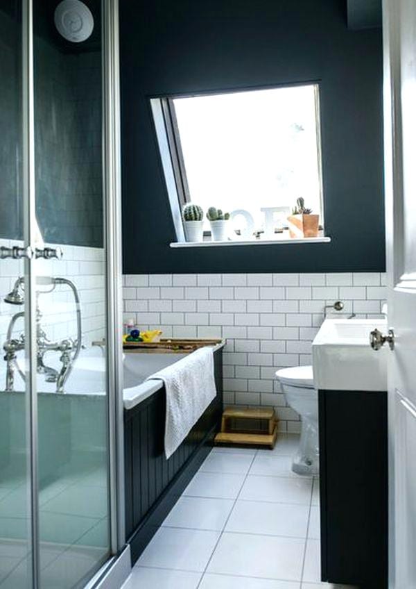
5. Midnight Green
“Midnight green (sometimes called Eagles green) is a dark shade of green. It is also a dark shade of cyan. This can be readily ascertained by noting the fact that this color’s red value is zero, and also that its green and blue values are almost equal. It’s the official primary color of the Philadelphia Eagles of the National Football League.” – Wikipedia
Last but not least, is Midnight Green. This is one of our favourite shades of green because it’s bold and sometimes so dark you can’t tell if it’s green or black. It’s a great contrasting color to reds and oranges and basically matches to black because of it’s dark pigment. We think it’s simply beautiful. What do you think?
