
We always get excited when annual paint colour trends are announced because it inspires us to change. It’s all too easy to fall back on what’s been tried and tested before, or to stick with a white that ‘goes with everything.’
2022 does not disappoint in the colour inspiration department. If you’re tired of white, you’re not alone: Colour has been trending hard and showing up in interior design projects in a big way. Homeowners are seeking a change in paint hues, especially desaturated organic hues with roots in the natural world.
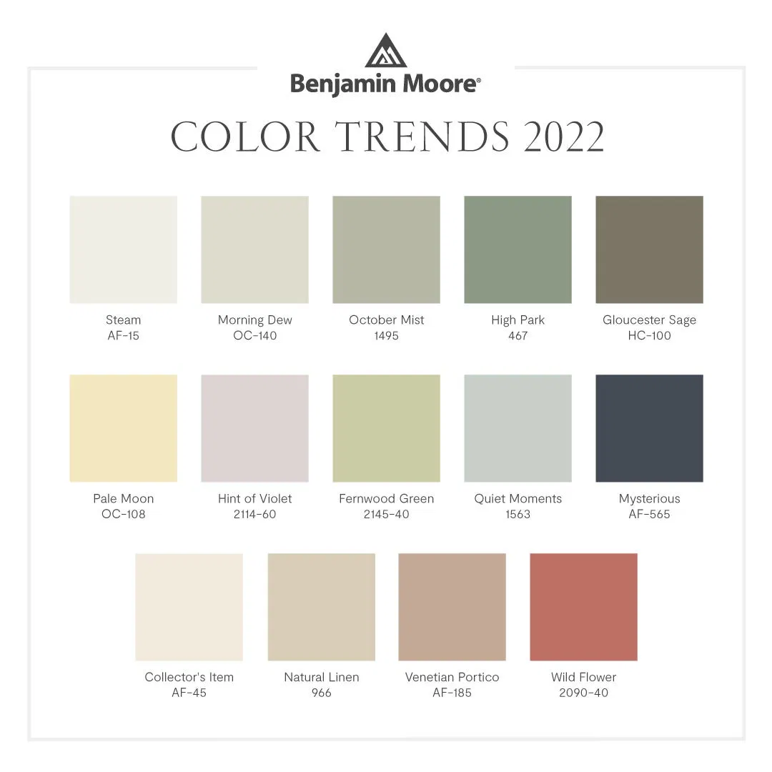
Benjamin Moore Colour Trends 2022
Benjamin Moore perfectly summarizes this trend toward muted organic colours in their ‘Colour Trends 2022’ palette. This palette of 14 colours is incredibly serene and suitable for all types of projects. By highlighting a full palette, it makes the picking of complementary colours painless in a space. This grouping enables an endless number of effortless, refreshing combinations for every design style. We’ll use this as a jumping off point before diving deeper into the most popular hues trending for 2022. Hint: They all relate back to this palette.
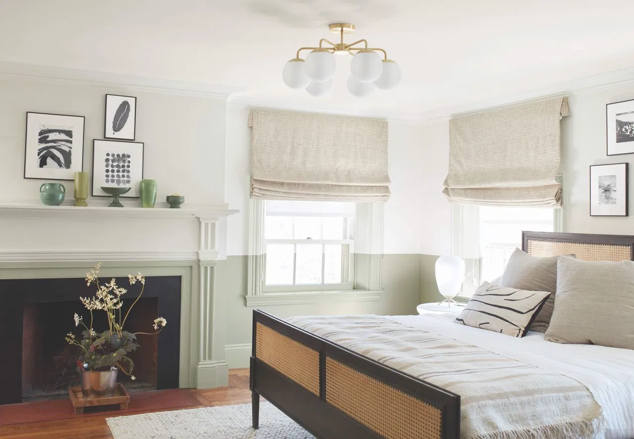
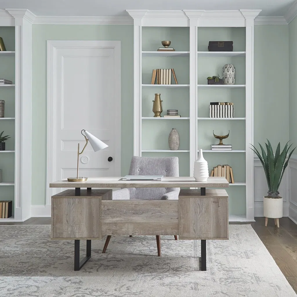
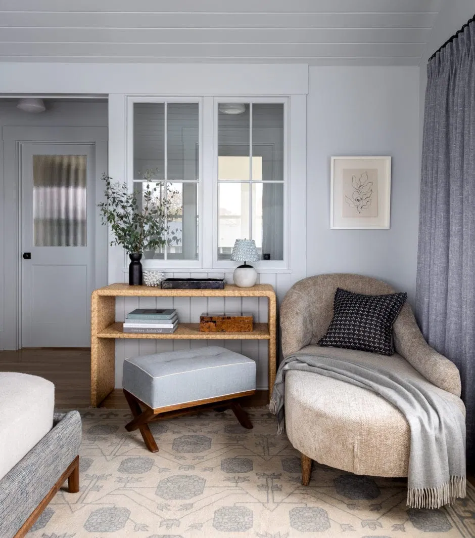
Their ‘Colour of the Year’ is October Mist 1495, a lovely soft green that works anywhere in the home. Benjamin Moore says, “This gently shaded sage quietly anchors a space, while encouraging individual expression through color…”—a description that perfectly suits the room shown above.
If this hue looks familiar, it is! Favourite designers have been applying soft greens to surfaces since at least 2018. What’s fresher now is treating it as a ‘foundational colour’ or neutral. You read that right: muted green as a neutral. Athena Calderone is quoted as saying, “I love how it inserts a touch of color but still reads as a neutral that pairs well with other tones within your home.” So go ahead and paint an entire room, trim and all, in a soothing green.
Above is a perfect example of the complementary colour palette concept in real life: interior designer Heidi Caillier demonstrates how natural hues such as sage, terracotta, linen, and creme work beautifully together in her home. (Tip: Go to her website to be blown away by her skillful mixing of colour.)
Green Gets the Green Light
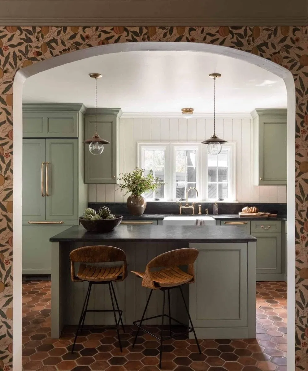
Besides muted sage greens, you’ll notice that a broader spectrum of green is everywhere. Even though it’s been appearing in design portfolios for awhile, finally in 2022 green has been named ‘Colour of the Year’ by almost every major paint brand including Sherwin-Williams, PPG, Farrow & Ball, and Behr.
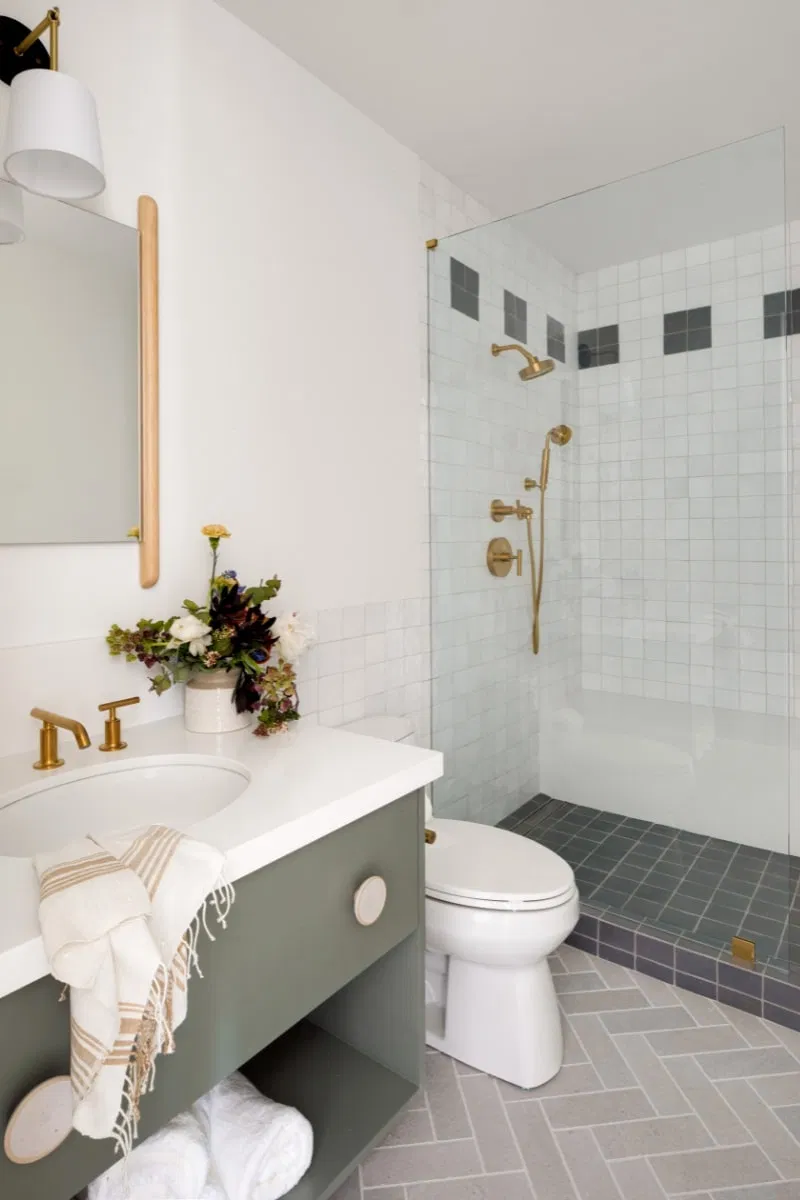
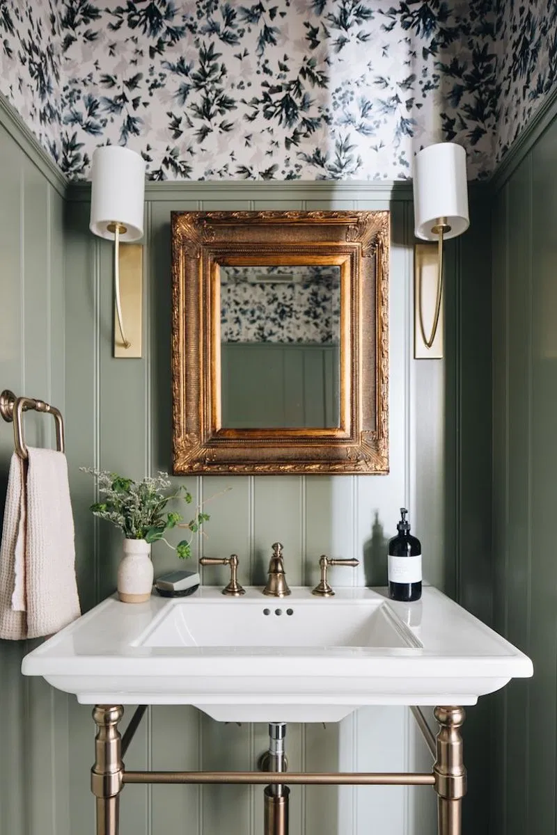
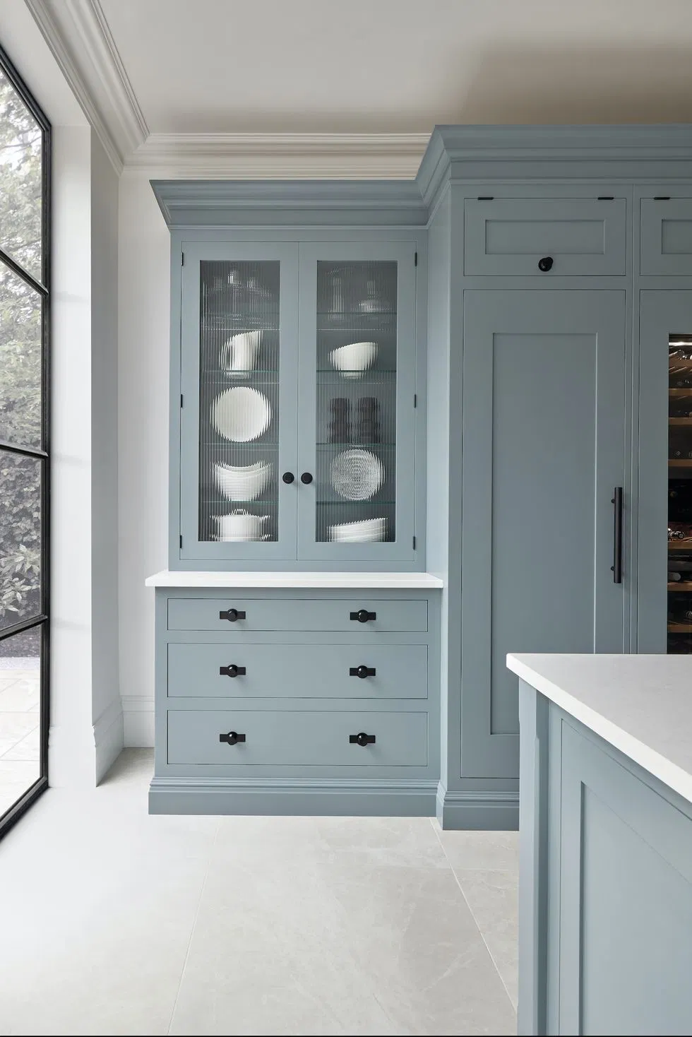
Why is green so popular? To start, it’s versatile and plays nicely with many colours and materials – like wood and brass – that we already love in our homes. In a tint (like Behr’s Breezeway), it’s crisp and fresh. As a tone (with grey), it can be more accessible for the apprehensive. For example, Lindye Galloway describes the vanity colour above as “a mossy gray hue that looks lovely. It’s a pop of color without being too in your face and is still neutral.“
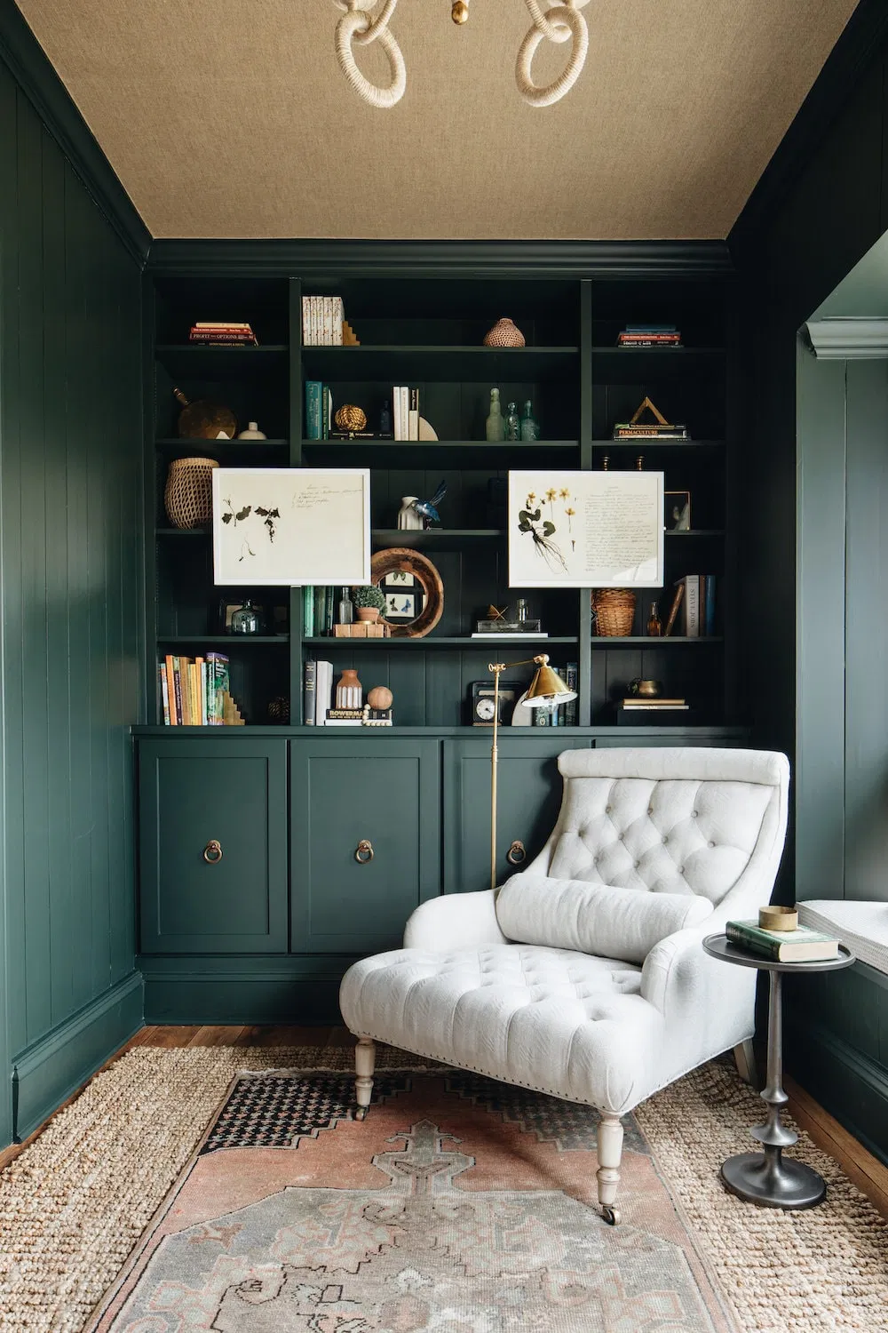
More lively, bolder greens like moss, basil, olive, emerald – and even aqua – are also popular in all types of rooms—not only the study.
If you’re not feeling confident about the change from white to saturated colour, a muted colour might be the best first step. Or start with a small area like cabinetry or a kitchen island before going all in.

Brown and Beige Are Back in Town
Not many people will admit that they like brown but when you call it “walnut”, “mushroom”, or “coffee”- basically anything you can ingest or find in nature, it’s A LOT more appealing. So stick with us when we tell you that the brown family is having a moment, especially the neutrals which are a piece of cake to introduce into your space.
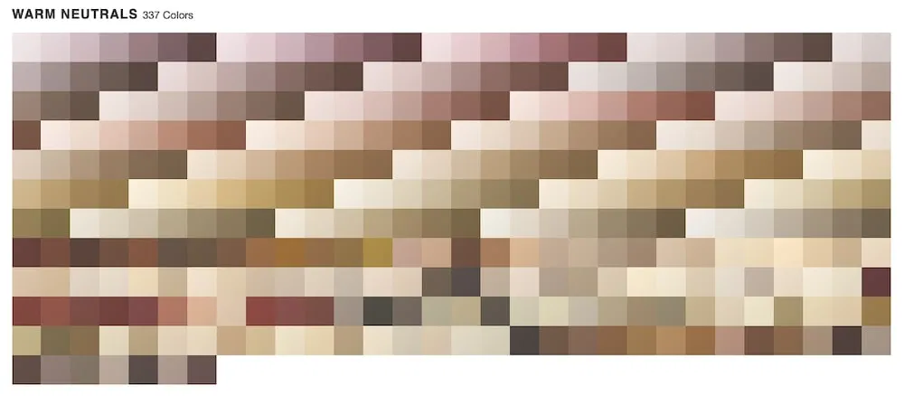
These ‘warm neutrals’ are part of the earthy, softer, and organic colour look in interiors that started around 2018 or earlier with terracotta. And now, look at all the options in the above palette!
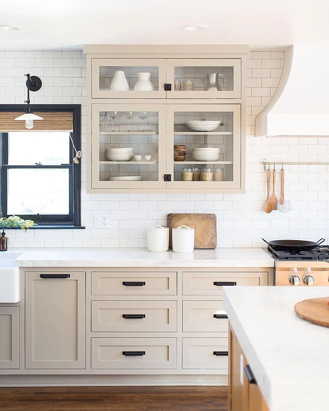
Stealing the show from cool greys, warm browns are the new easy-to-use-anywhere neutral. This colour group includes creme, beige, stone, taupe, and chocolate. With beige stone colours in the kitchen and paler sandy tones in the bedroom, these hues are infinitely more cozy and welcoming than white.
Source: Dunn Edwards – Art and Craft (2022 Colour of the Year)
This is where we’ll try to convince you (if you’re not already with us) that earthy can be sophisticated, especially in a monochromatic scheme with rich textures. Dunn Edwards notes that this hue is “Comfortable, cozy, calming and versatile, as a warm and welcoming color, it makes us feel tied to the earth and nature’s seasons…”
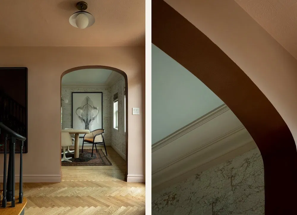
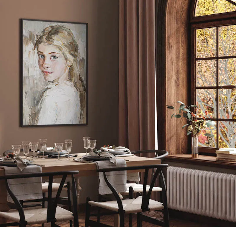
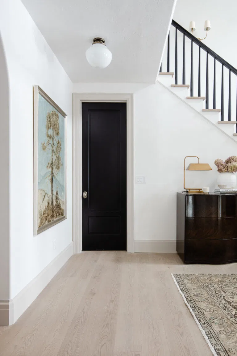
Pink-browns are a segment of earthy tones that pair beautifully with lighter creams, deep browns and our new friend sage green—a desert palette that’s both comforting and luxurious. The blush shade in the entryway above (Portola’s Angel’s Landing) is grounded by browns and black accents.
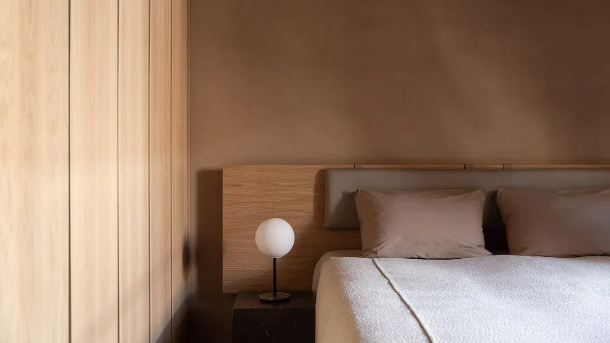
We’re fully behind this use of more toasty hues to warm up bedrooms, whether on walls or textiles. Again, a monochromatic palette lends a sense of approachable elegance.
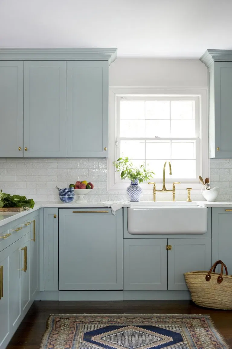
We’ve Got the Pale Blues
Last but not least, there’s pastel blue. It’s a classic that’s easy-to-love and to work into almost any project. It’s no surprise that this hue has picked up steam during the pandemic, when many of us want to be surrounded by a sense of calm at home.
Light blue paint reminds us of the soothing tones of the sea and the sky, which is why it’s an effortless choice to paint in spaces that we want to relax in, like spa bathrooms and bedrooms.
While a breezy pale blue laundry room also comes to mind with this hue (who doesn’t want to feel more zen while washing piles of clothes?), it looks dreamy on cabinetry in light-filled kitchens.
A Quick Word on Finishes
We admit it, paint finish or sheen selection is confusing. To make matters slightly worse, each paint brand tends to have a different label. Here’s a great guide from Benjamin Moore detailing all of the options.
In general, the type of surface and its location will determine which finish you should use. For example, on the trim above (hello, taupe!) the designer uses a different sheen from the walls. Hint: This look of trim with colour – not white! – is also trending right now.
Below is our interior designers’ recommendation of how to use different sheens, based upon Benjamin Moore’s product names:
Walls – Ulti-matte or eggshell
Trim & wainscoting – Satin
Ceiling – Ultra flat
Bath & spa – Ulti-matte
We hope that you’ve enjoyed this shift towards embracing and playing with color, even the more dramatic colours like rich greens and cozy earth tones. And while we didn’t touch upon terracotta too much, we’re predicting that we’ll keep seeing it but in a muted way. Pink hues are to come!